


Haven
Role
Designer/Student Project
Team
Individual Project
Tools
Adobe XD, Illustrator,
InDesign, After Effects
Problem
Women's safety issues are often overlooked in urban design due to systemic sexism.
Solution
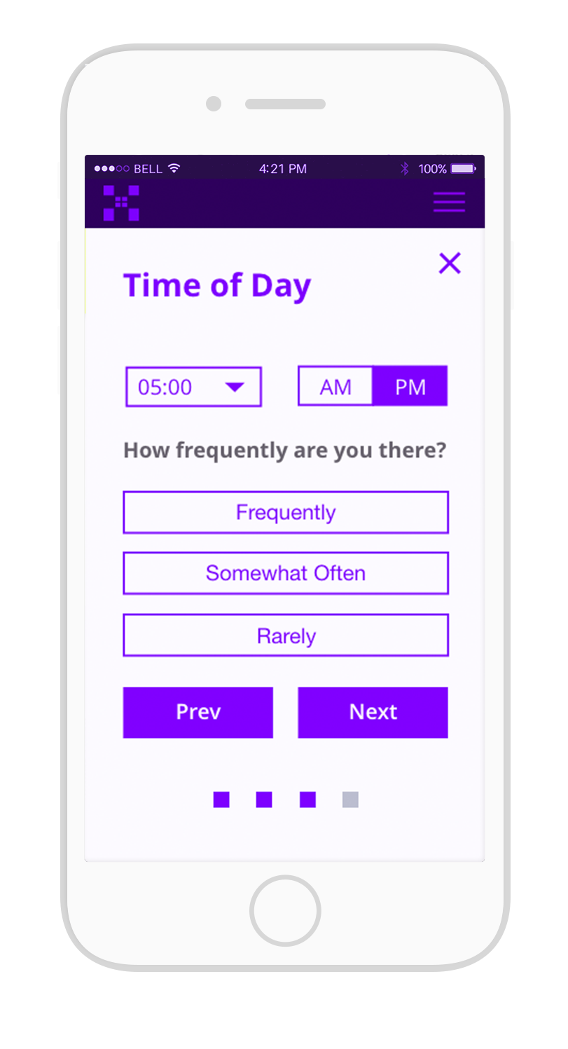
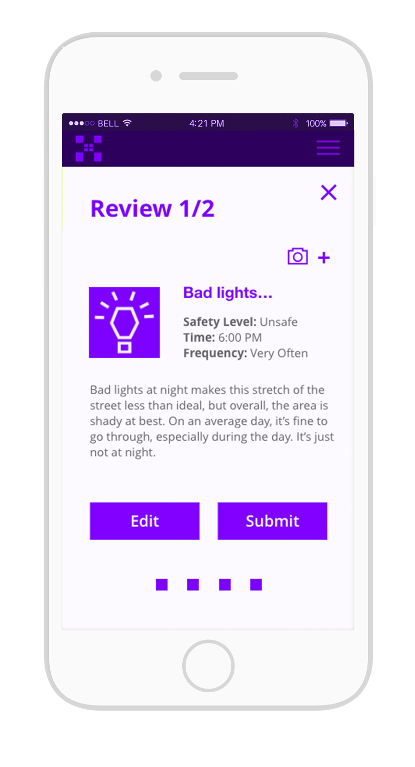
Haven is a hypothetical organization that partners up city officials, urban designers, and the public to collect data specific to women’s perception of safety. Haven goes to the source; getting data from women, and utilizing a voting system to get a better sense of the changes that need to be made.

Main Logo
Haven's flagship logo for the brand. When Haven is implemented within a city, it is paired up with the name of the city underneath in promotion materials.

Gather
The Haven logo in “Gather” form, is used on materials that represent both the gathering and exchange of information.

Navigate
The "Navigate" form shows up more commonly on the app when the user utilizes its navigation features.

Early explorations of the Haven logo

Desktop wireframe exploration of Haven in the context that some users might want not want to use an app. This was out of scope for the project in the end.


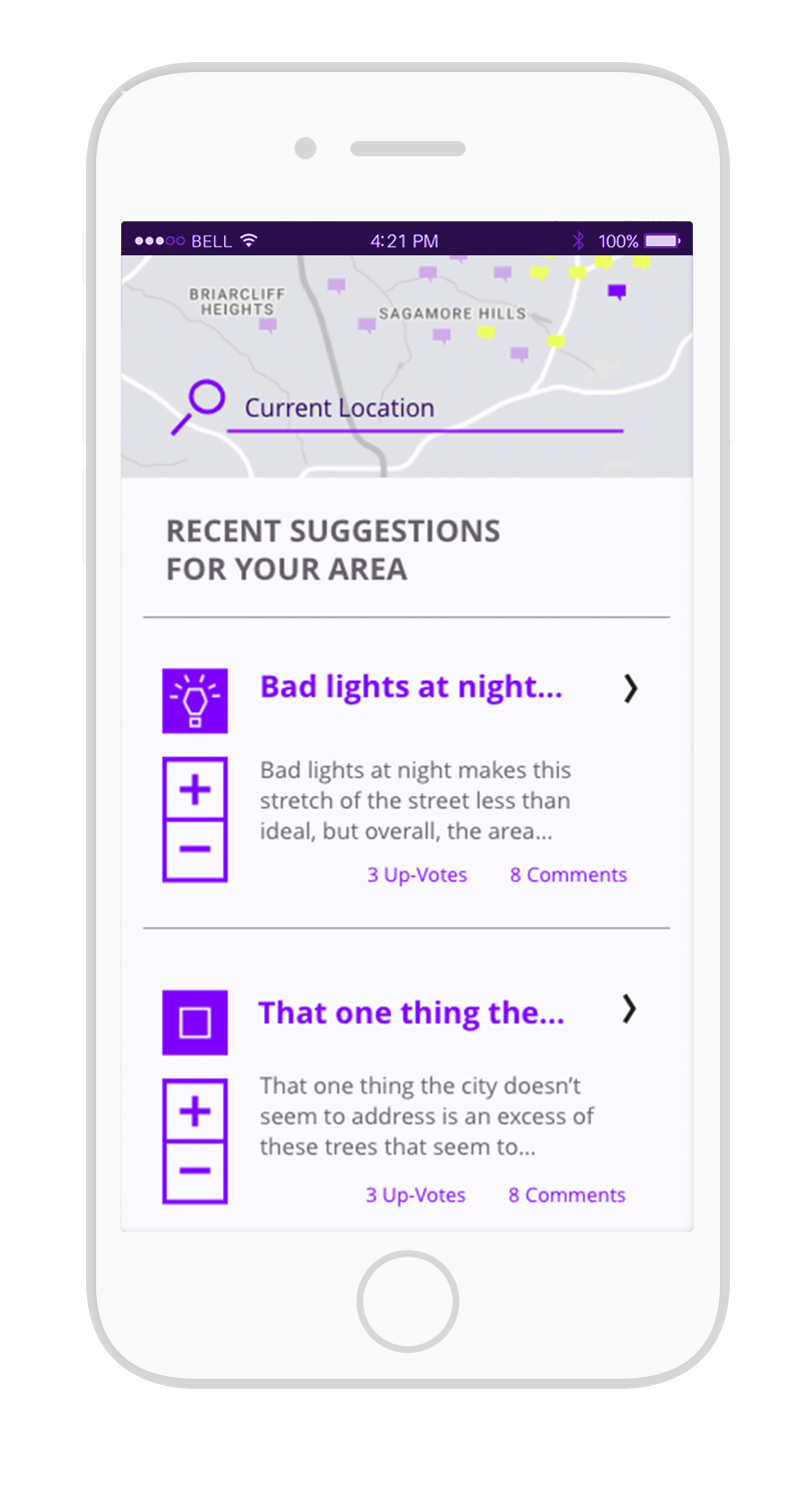
Safe
The Haven brand color is used to represent Safe, an area that is assigned this color according to the crowdsourced data. The color is a vibrant energetic purple that denotes intelligence, security, and authority.
OK
OK is a faded purple that is an area considered in between Safe and Be Wary. While not an unsafe place, the location is deemed not entirely safe either.
Be Wary
Using the opposite of the Safe color, the neon yellow is supposed to signal caution and alertness. The color is used to indicate that the area is unsafe.
The Haven Grid
The grid is the originator for all three logo forms, including the square pattern that shows up on the app's loading screen. and the Haven booklet.


Pairing examples when logo is teamed with a city.
Haven Booklet
For those who are technology adverse or unable to get their hands on a smart phone to use the app, Haven offers a booklet that can be picked up at local libraries, community centers, and police stations. The booklet explains what Haven is and allows people to submit their suggestions for safety improvements. A seal and a paid stamp makes it easy to drop the booklet into the mail.